Inspiring curtain colors to enhance every room

Choosing the right curtain color plays a crucial role in creating a soothing atmosphere in your room. Curtains not only serve the practical purpose of covering windows but also act as a significant decorative element in shaping the overall look and feel of the space.

By selecting the right color, you can achieve a comfortable and harmonious ambiance, whether it’s a calming minimalist vibe or a refreshing, beautiful look.

Neutral colors and solid patterns can create a tranquil and relaxing environment, while vibrant hues can add energy and cheerfulness. It’s also important to consider how the color interacts with natural light and other interior elements in your home.

In this article, we will share recommendations for curtain colors that are perfect for bedrooms and other spaces, as well as tips on choosing colors that foster a positive atmosphere and enhance your home’s aesthetics.

Read also: An extra-small Scandinavian-style living rooms full of cheer and smart storage
 

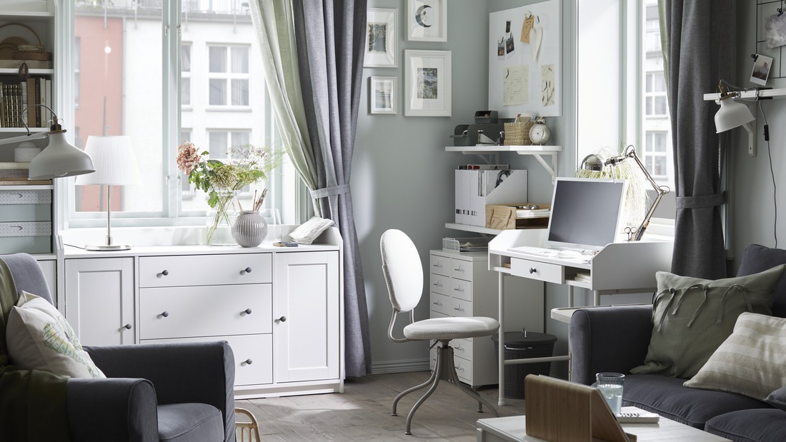
Tips for choosing curtain colors that match your living room décor

Selecting the right curtain color is essential for creating a calming and harmonious atmosphere in your living room. Here are some tips to ensure your curtains align with your décor and enhance the well-being of the space:
 

1.Match with the room's color palette

To create a serene and balanced environment, it's important to match your curtain color with your room's color palette. If your room features neutral tones like cream, beige, or gray, curtains in similar hues can enhance the sense of tranquility and order.

If you want to add a touch of energy without disrupting the ambiance, consider curtains in soft blue or warm brown tones that complement the room’s paint color.

Colors like black can provide a touch of elegance and deep contrast, while softer shades like gray or cream offer a more soothing effect. Choose colors that blend well with other elements in the room to create a harmonious balance.
 

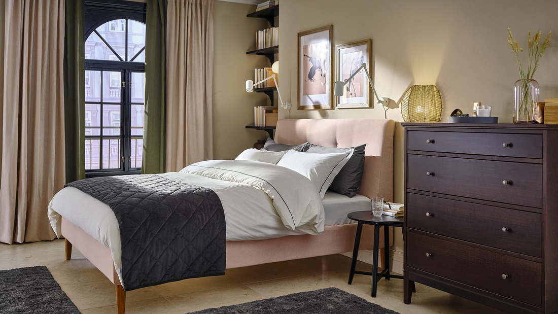
2. Align with design style

In addition to color matching, it’s also important to ensure your curtains align with your living room's design style. For a minimalist home, opt for curtains in neutral tones such as black, white, cream, or gray that support a clean, simple look.

These colors will also complement an elegant, minimalist atmosphere and maintain visual balance in your room. If your room's style is more traditional or classic, richer colors like brown or blue can add depth and character, reinforcing the room’s décor theme.

By selecting curtain colors that align with your home’s design style, you’ll not only enhance aesthetics but also create a space that supports your well-being and comfort.
 

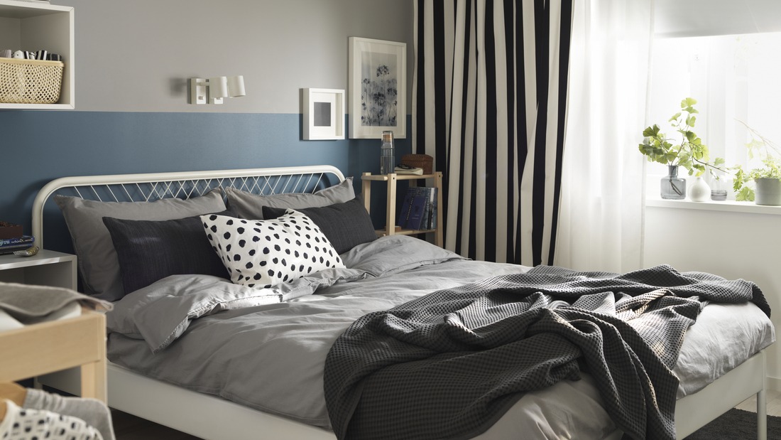
Current curtain color trends

Incorporating current curtain color trends into your home can create a calming and harmonious atmosphere. This year’s color choices offer both elegance and freshness.

Deep navy and dark blue curtains, for instance, create a sense of calm and depth, exuding a feeling of peace. Olive green and sage green add a natural touch that brings coolness and freshness into your space.

For an elegant minimalist look, cream and beige remain favorites, offering a clean and versatile beauty. If you wish to add warmth, consider brown or terracotta, which add dimension and a cozy atmosphere to your room.

Black curtains provide a dramatic and sophisticated touch, while gray or white are perfect for creating a clean and serene impression. Yellow curtains also offer a bright accent that invigorates and refreshes.

By considering these colors and how they can be fitted to make the most of natural light, you can create an ambiance that supports well-being and comfort.
 

How to combine curtain colors with other accessories

Combining curtain colors with other accessories in your space can create a harmonious and pleasant atmosphere. Start by selecting accessories such as cushions, rugs, and artwork that complement your curtains well.

For instance, if you choose blue curtains, pillows in bright orange or soft white can add a fresh and cheerful touch. A rug with matching colors or patterns will add depth and visual balance to your room.

Warm and elegant brown curtains can be paired with neutral-colored accessories that fit well to create a spacious and calming effect in the room. Neutral-colored walls also pair well with neutral curtains, like white, which help to expand the look of the space and create a soothing effect.

For livelier accents, choose bright curtain colors, like orange, which can add positive energy to the room. With balanced color combinations and accessories, you can create a space that is not only visually appealing but also supports your well-being and comfort.
 

Common mistakes in choosing curtain colors

Choosing the right curtain color is crucial for creating a harmonious atmosphere in your home. However, some common mistakes can disrupt the balance and comfort of a space. Here are some things to avoid to ensure your curtain color supports well-being and creates a pleasant environment:
  • Ignoring the room's color scheme: A frequent mistake is not considering the overall color scheme of the room. Choosing yellow or other curtain colors that do not harmonize with wall colors or furniture can disrupt visual harmony. To create a peaceful and enjoyable space, ensure your curtain color complements other elements in the room, creating a natural and elegant unity.
  • Choosing colors that are too dark or too light: Selecting curtain colors that are either too dark or too light can drastically affect the room's mood. For example, black can make a room feel cramped if not used wisely. Conversely, overly bright colors like yellow might be overwhelming in a large room. Choose colors that suit the room’s size and function to create a comfortable and soothing environment.
  • Neglecting light balance: Overlooking the impact of curtain color on natural lighting can affect room comfort. Dark-colored curtains, like light gray, can reduce natural light, making the room feel less bright, while overly bright colors might disrupt privacy. Choose colors that balance lighting needs and privacy, creating a well-balanced and comfortable atmosphere.
  • Ignoring quality and texture: Color is not the only consideration; curtain fabric and texture also affect the final result. Bright-colored curtains may be appealing, but if the curtain material does not suit the room’s design, the result might be unsatisfactory. Choose curtains with quality fabrics that match the ambiance you wish to create, ensuring comfort and aesthetic cohesion.
  • Overlooking Curtain Function: Curtains are not only decorative but also serve practical purposes. A common mistake is choosing colors that seem attractive but do not meet practical needs like light control and privacy. Ensure curtains function well, especially in children’s rooms or spaces with specific home designs. Choose colors that enhance the room’s beauty while fulfilling its practical functions effectively.

By considering these aspects, you can avoid common mistakes and select curtains that support well-being, creating a comfortable and harmonious space in your home, whether with light brown colors, wall colors, or bold contrasts that make your room look more elegant and luxurious.
 

Achieve the perfect balance with ideal curtain colors

Choosing the right curtain color is key to creating a comfortable and harmonious atmosphere in your home. By selecting appropriate colors, you not only enhance the room’s aesthetics but also create an environment that supports daily well-being and comfort. Be sure to consider style and functionality when choosing curtain colors to achieve the best results.

Explore IKEA’s collection of curtains and window panels to find a variety of colors and designs that meet your needs. With the wide range of options available, you can find solutions that not only beautify your space but also create a pleasant and functional atmosphere.

Back to top
cross